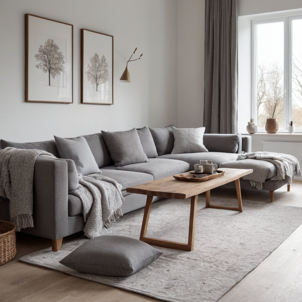
1. Winter White and Frosty Gray
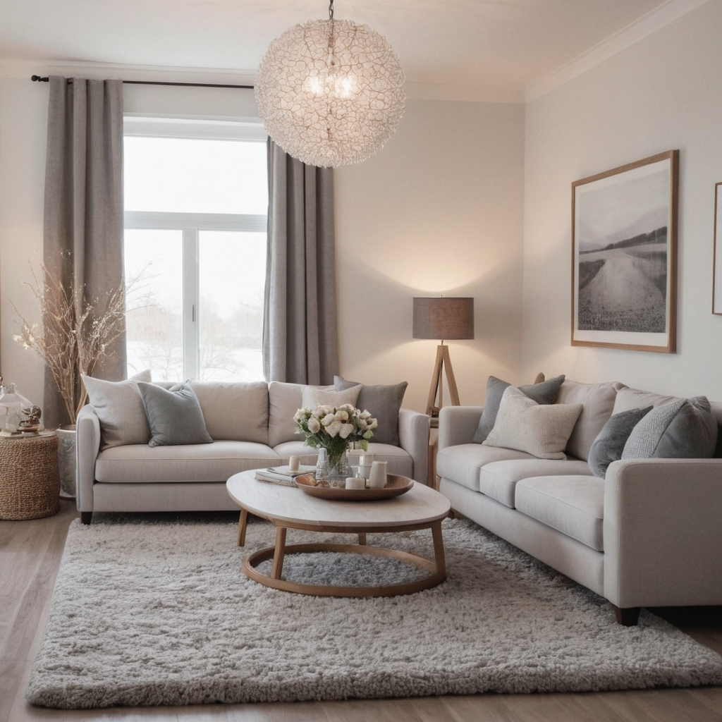
Winter-themed color palettes are characterized by cooler tones that evoke the chill of a winter’s day but with a cozy warmth. This palette features white as the primary color, paired with frosty grays to create a serene and tranquil atmosphere in any room. The use of whites and cool grays can make spaces feel larger and more open, perfect for smaller rooms looking to maximize their perceived size. For practical application, incorporate these colors through large furniture items like sofas or beds, then add texture and warmth with accessories such as throw pillows, rugs, and blankets in rich fabrics.
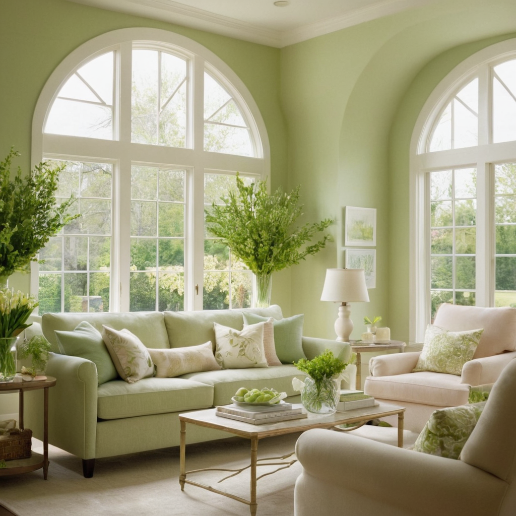
2. Spring Pastels and Fresh Greens
Spring brings renewal and growth, which can be translated into pastel shades paired with fresh greens in interior design. Soft pinks, minty greens, and gentle blues are perfect for creating a soothing environment that’s both welcoming and light-hearted. This palette is ideal for rooms where you spend time relaxing or working from home as it promotes feelings of optimism and tranquility. To implement this look, start with soft pastel walls and complement them with furniture in deeper, coordinating colors. Introduce natural elements like indoor plants to enhance the room’s connection to nature.
3. Summer Sunbursts and Soft Beiges
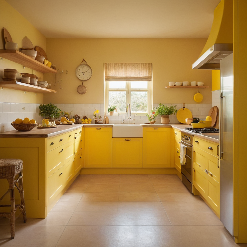
For those looking to bring the warmth of summer indoors, consider sunburst hues like yellows and oranges paired with soft beiges. These colors can instantly uplift a room’s mood, making it feel brighter and more lively. The key is to balance the warm tones with softer neutrals to avoid overwhelming the senses. This palette works particularly well in kitchens or dining rooms where you want to evoke feelings of joy and positivity. Practical tips include using lighter shades on walls and then adding pops of sunburst colors through accessories like kitchen towels, cushions, or decorative plates.
4. Autumn Rustics and Rich Terracottas
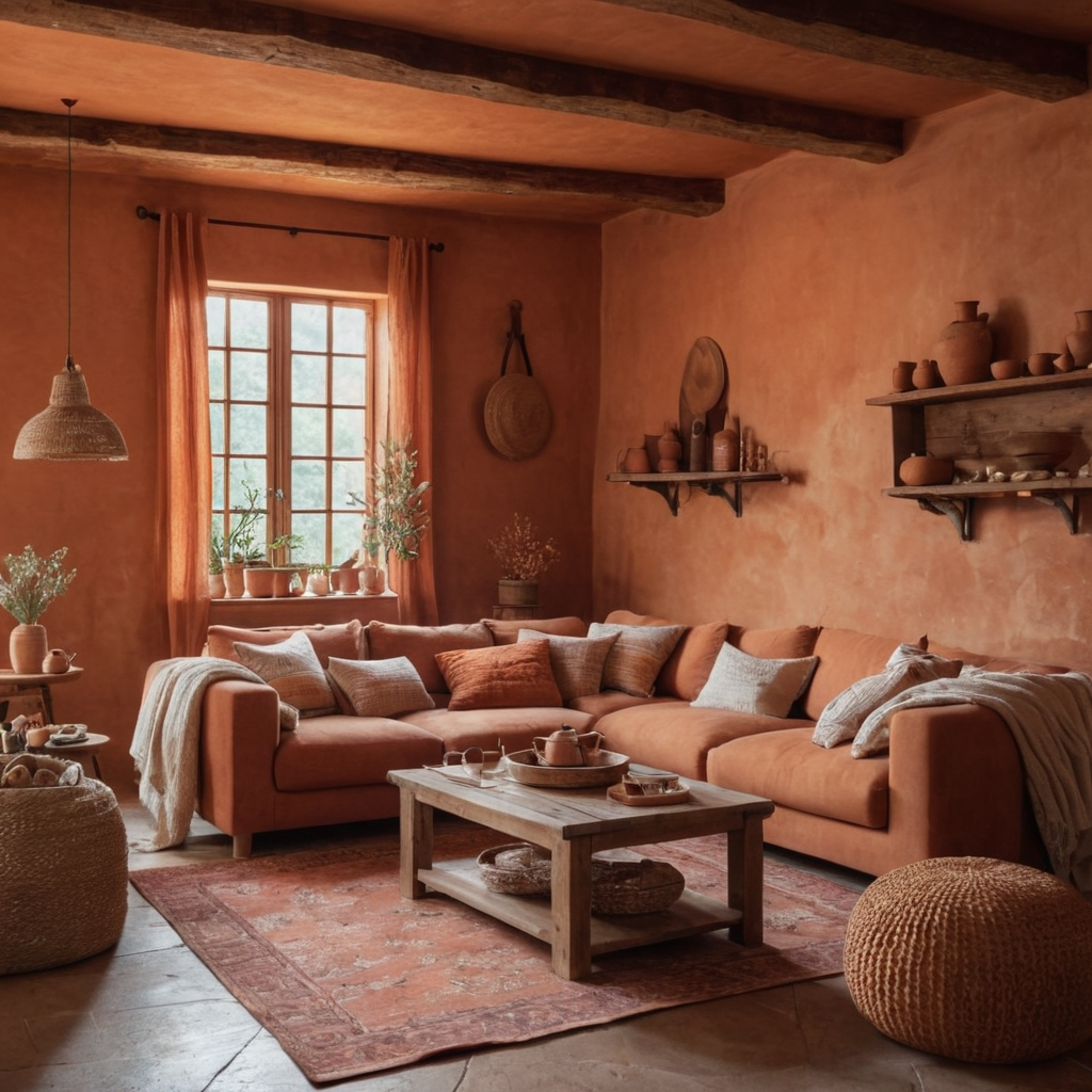
Autumn brings rich, earthy tones that can be used to create a warm and inviting home environment. Deep rusts, terracotta, and muted oranges are perfect for this purpose. These colors not only add warmth but also evoke feelings of comfort and nostalgia. Ideal for living rooms or family spaces where you entertain guests or spend quality time with loved ones. To achieve this look, use the deep tones on smaller furniture pieces or as accent walls. Balance these strong hues with softer textures like wool or cotton in cushions and throws to create a cozy atmosphere.
5. Seasonal Accent Walls for Year-Round Appeal
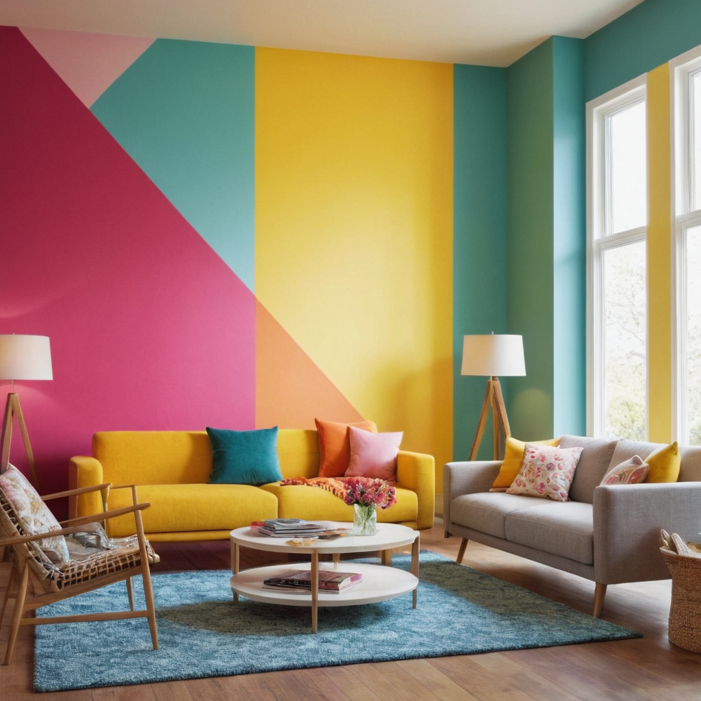
Accent walls are a dynamic way to infuse your home with seasonal energy without committing fully to new paint schemes. Consider using brighter, bolder colors on an accent wall during the warmer months and more subdued tones in winter. For example, a deep blue or vibrant red can transform a room in summer, while soft grays or greens provide warmth in colder seasons. This technique allows you to experiment with color trends and change your home’s vibe regularly without extensive redecoration efforts.
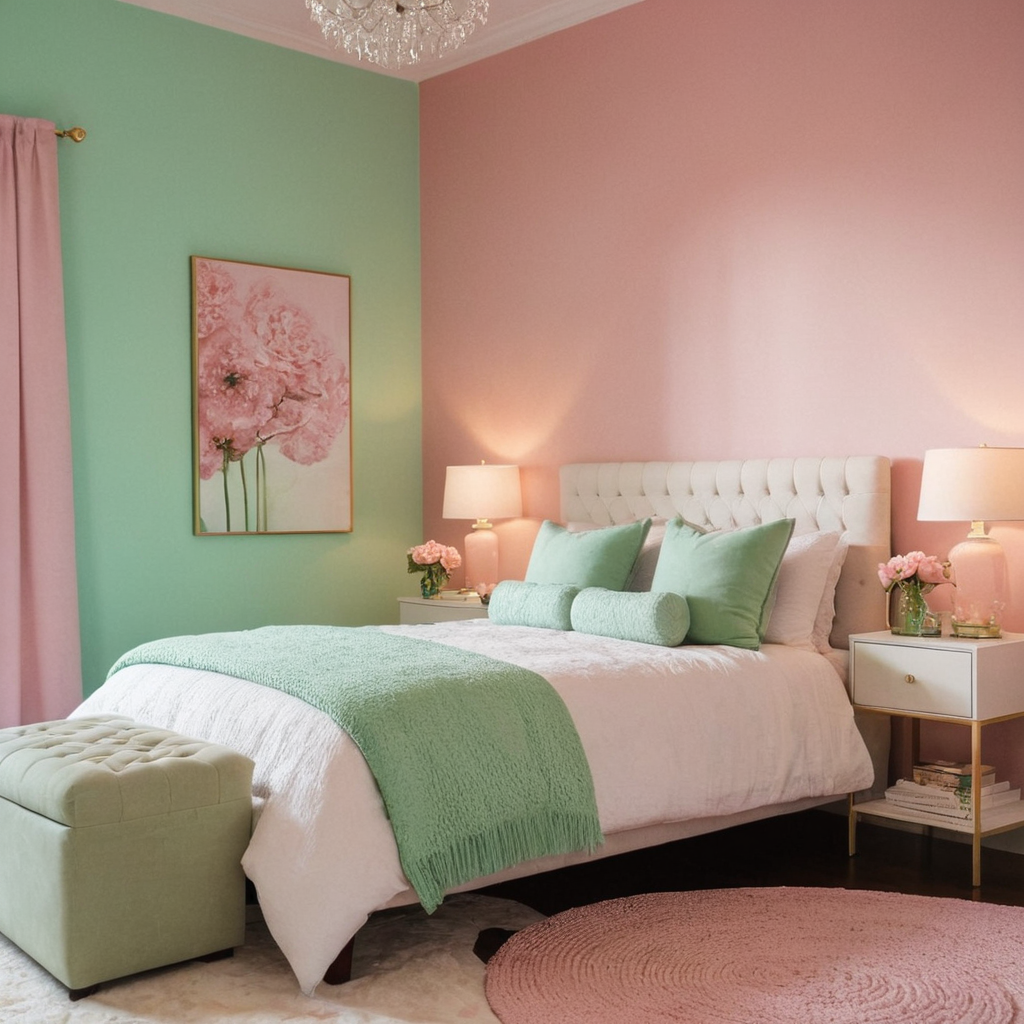
6. The Psychological Impact of Colors on Your Mood
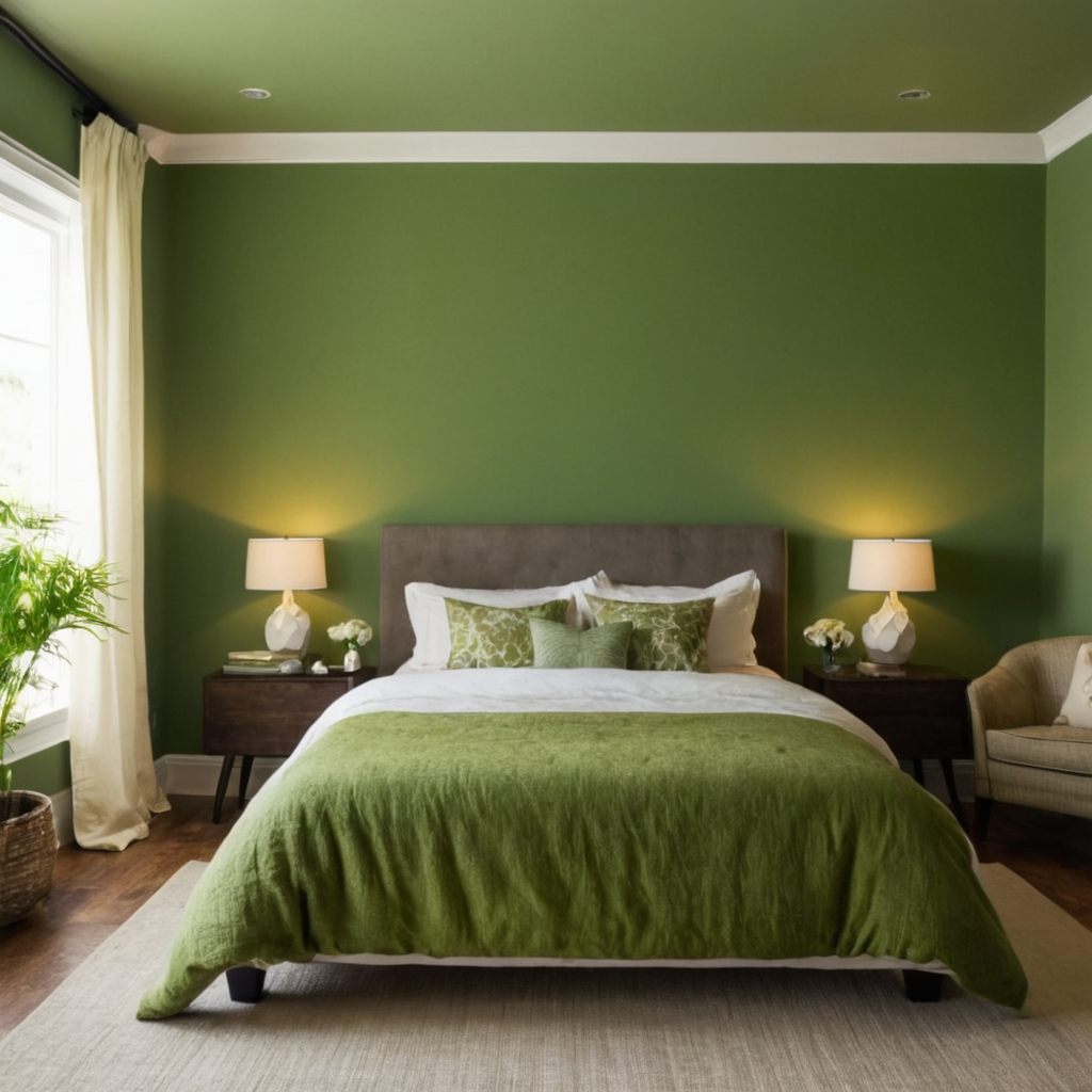
Colors can significantly influence our emotions and behaviors, making it crucial to choose them thoughtfully for your home environment. For instance, blues are known to evoke calmness and serenity, while reds stimulate excitement and energy. Greens promote relaxation and harmony, ideal for bedrooms or meditation spaces. Understanding these psychological effects allows you to design rooms that support the intended function of each space. Incorporate colors in a way that complements your lifestyle and preferences; use them to enhance focus in work areas or encourage restful sleep in bedrooms.