1. Winter Wonderland: Cool Blues and Whites
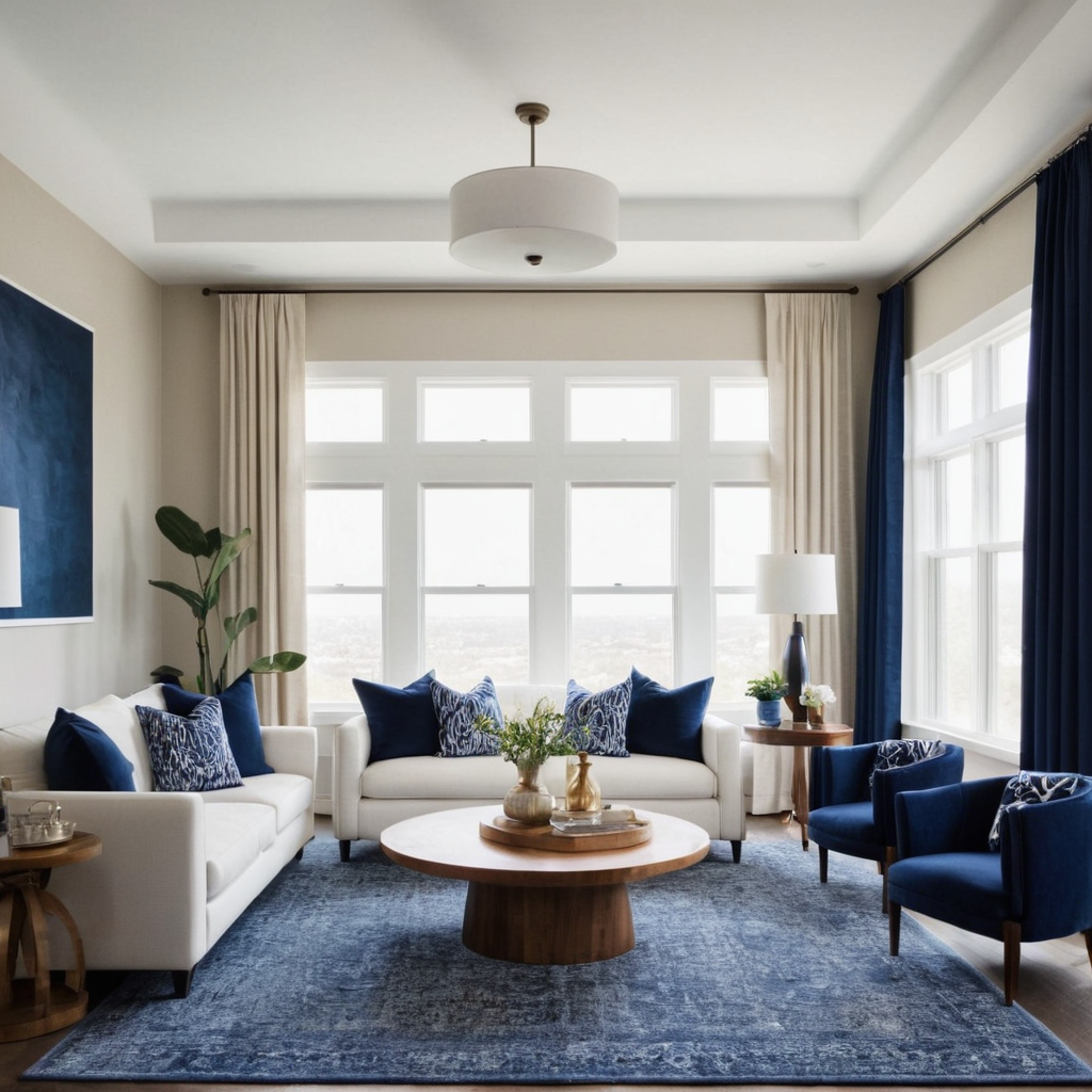
Winter’s crisp, cool tones translate beautifully into home interiors. Imagine a serene living space where shades of blue and white dominate, evoking feelings of calm and tranquility. These colors not only bring the outdoors in but also create an atmosphere that is perfect for relaxation during colder months. The psychological effects are soothing and can help reduce stress levels.
When applying this palette to your home, consider using whites on large surfaces like walls or ceilings to reflect light and make spaces feel brighter. Add touches of blue through textiles such as throw pillows, curtains, or rugs. For a subtle accent wall, opt for a deep navy to add depth without overwhelming the room.
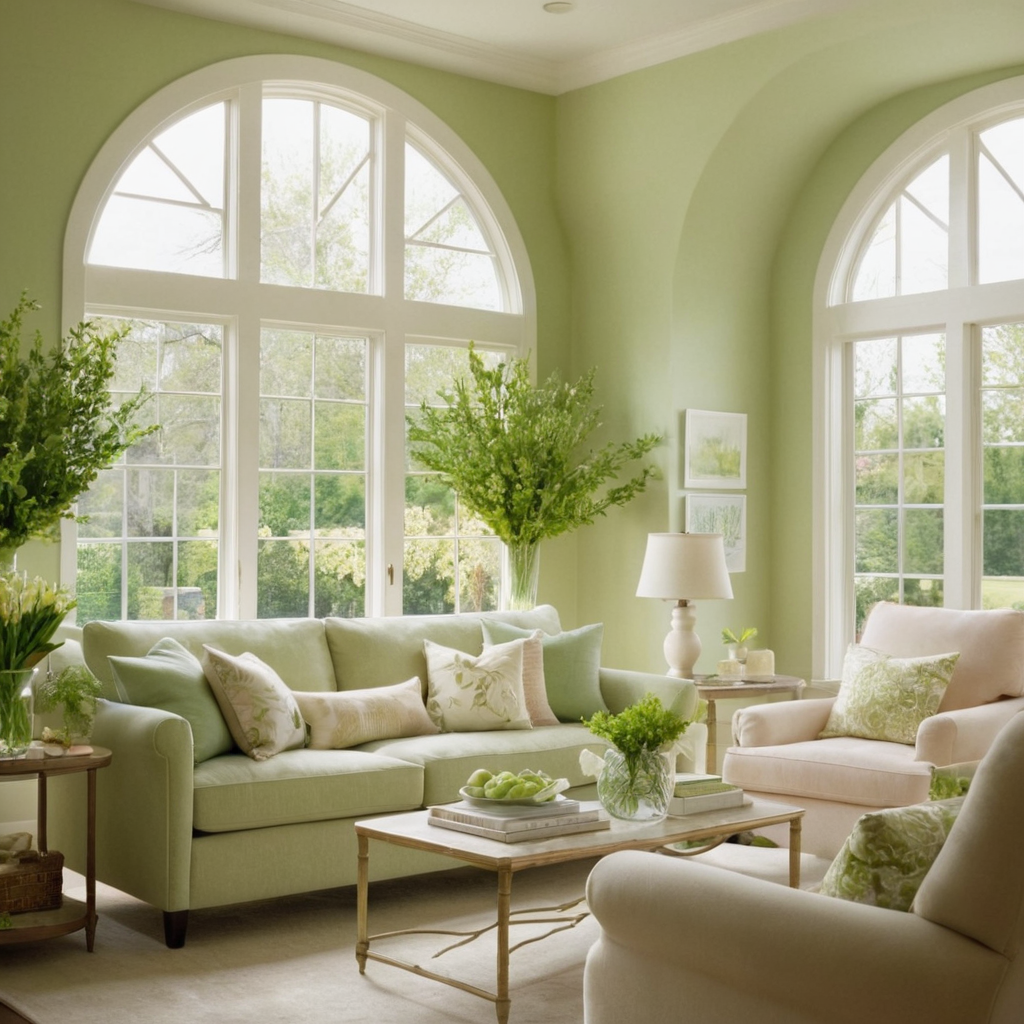
2. Spring Bloom: Pastels and Neutrals
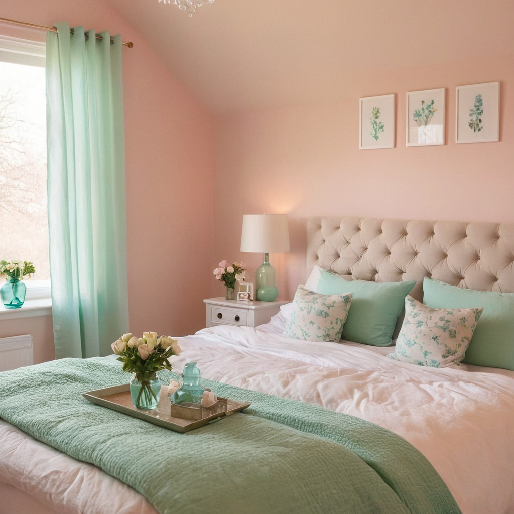
Spring is all about rejuvenation and new beginnings, which translates into a vibrant yet gentle color scheme in home design. Think soft pastel hues like blush pink, mint green, and baby blue against neutral backgrounds such as beige or gray. These colors can lift the spirits and create an inviting space that reflects the freshness of springtime.
To style this palette, use pastels in smaller decorative items like cushions, vases, or small wall art pieces to start with a subtle touch. Gradually incorporate more vibrant elements as you feel comfortable. For larger areas, choose neutrals for walls and furniture, allowing the pastel accents to stand out.
3. Summer Soak: Brights and Earth Tones
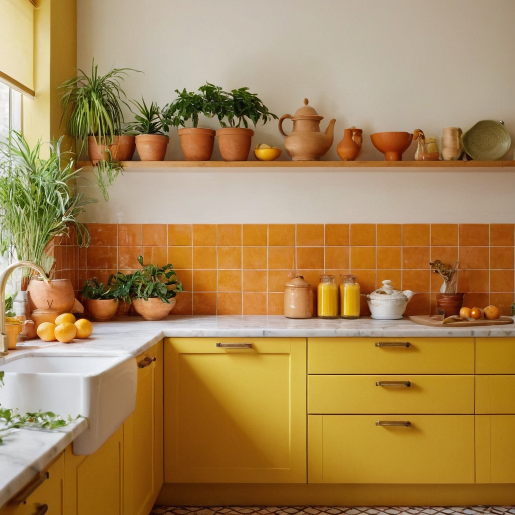
Summer’s bright, sunny days can be captured in your home through bold colors paired with warm earth tones. Think of vibrant yellows, oranges, and reds contrasted against the stability of browns and terracottas. This palette not only brings energy into spaces but also reflects the warmth and vibrancy of summer.
To implement this palette effectively, use the brighter shades as accents to avoid overwhelming the space. Consider using these colors in textiles like throw blankets or kitchenware. Earth tones can be used for larger furniture pieces or as a base color on walls. Adding plants or earthy textures such as woven baskets can enhance this summer theme.
4. Autumn Glow: Rich Reds and Golds
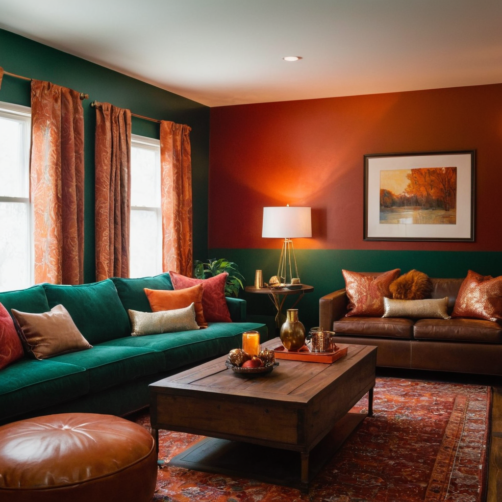
Autumn’s rich colors can transform your home into a cozy haven. Deep reds, golds, and oranges contrasted against dark greens and browns create an inviting atmosphere that evokes feelings of warmth and comfort. These colors are not only visually stunning but also have psychological benefits like stimulating appetite or adding a touch of luxury.
To style this palette in your home, start with larger surfaces like rugs or curtains that can anchor the space with these warm tones. Use reds as accents through pillows or decorative items to add pops of color without overwhelming the room. Incorporate gold elements through metal finishes on lamps and picture frames for a touch of luxury.
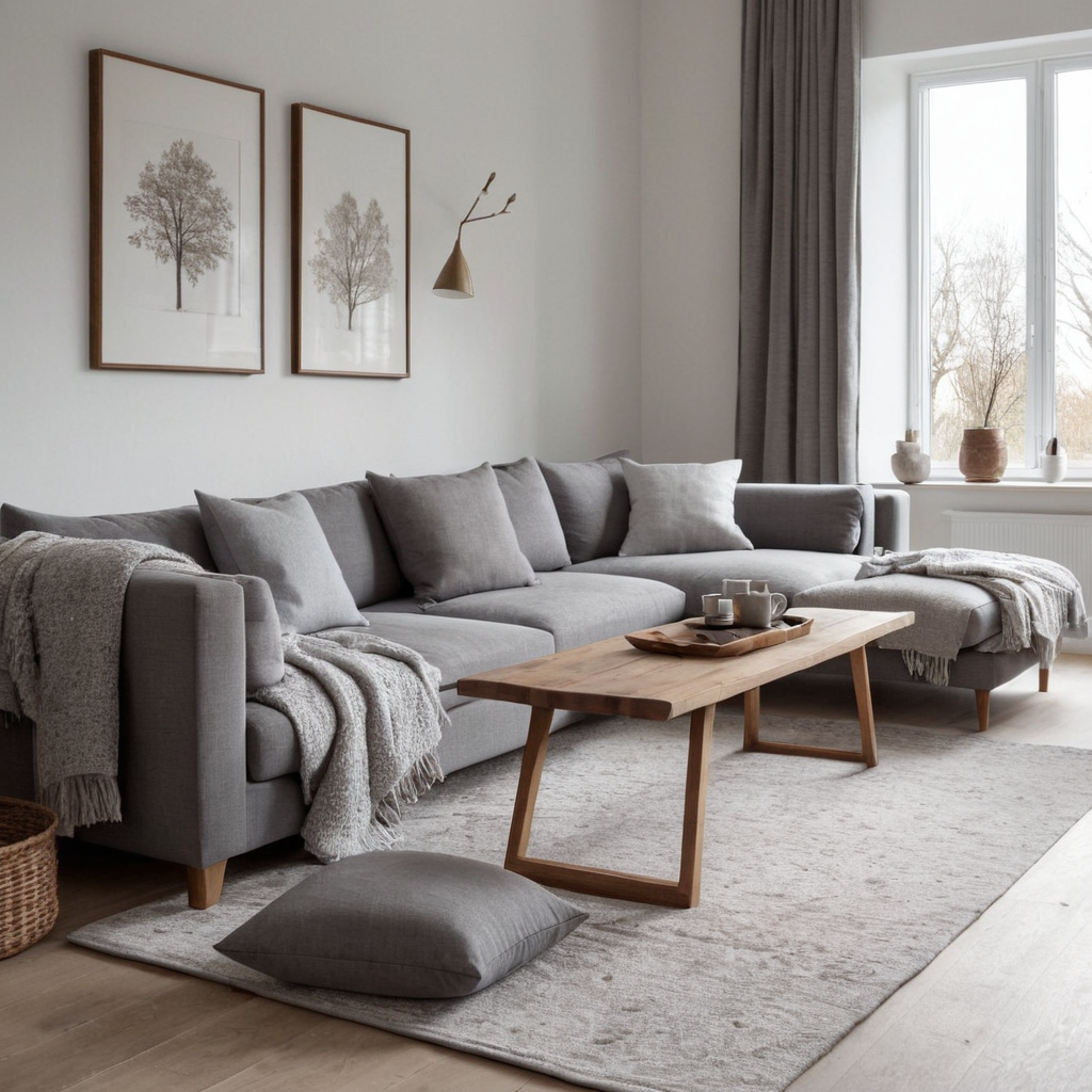
5. Year-Round Elegance: Grays and Neutrals
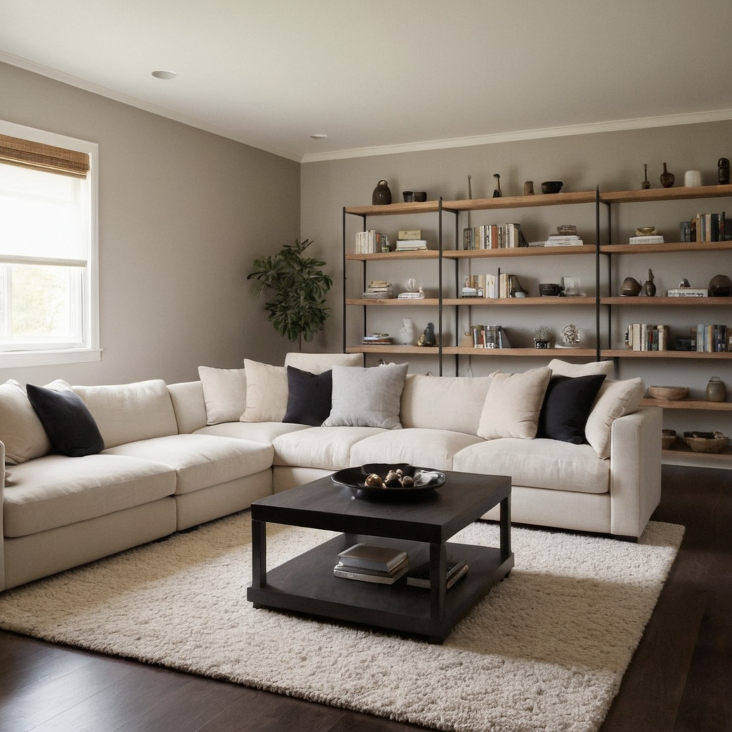
For a timeless look, consider a palette of grays and neutral tones that never go out of style. These colors provide a calm backdrop for any room while offering flexibility in styling with different decor items over time. The psychological impact is one of balance and sophistication.
When designing your space using this palette, choose various shades of gray for walls to create depth and dimension. Mix in neutrals like black or white in furniture and textiles to keep the look modern. Add texture through materials like velvet or linen to enhance comfort and visual interest without introducing new colors.
6. Bold Accents: Using Vibrant Colors on Accent Walls
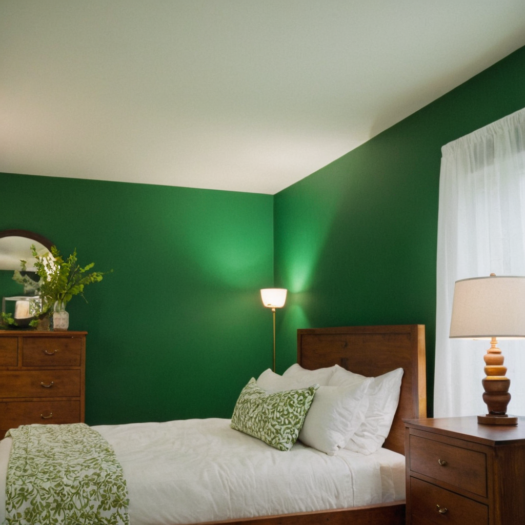
Adding a splash of vibrant color to an accent wall can completely transform your home’s aesthetics. Whether it’s emerald green in the bedroom, mustard yellow in the dining room, or teal blue in the living area, bold accents draw attention and create focal points within rooms.
To effectively incorporate an accent wall into your decor, consider placing it behind a key piece of furniture such as a bed or sofa to enhance its visual impact. Use the vibrant color for one wall only to avoid making the space feel cluttered. Pair this bold statement with more neutral colors on other surfaces and in textiles to balance out the vibrancy.