1. Winter White & Cool Grey: A Clean Slate
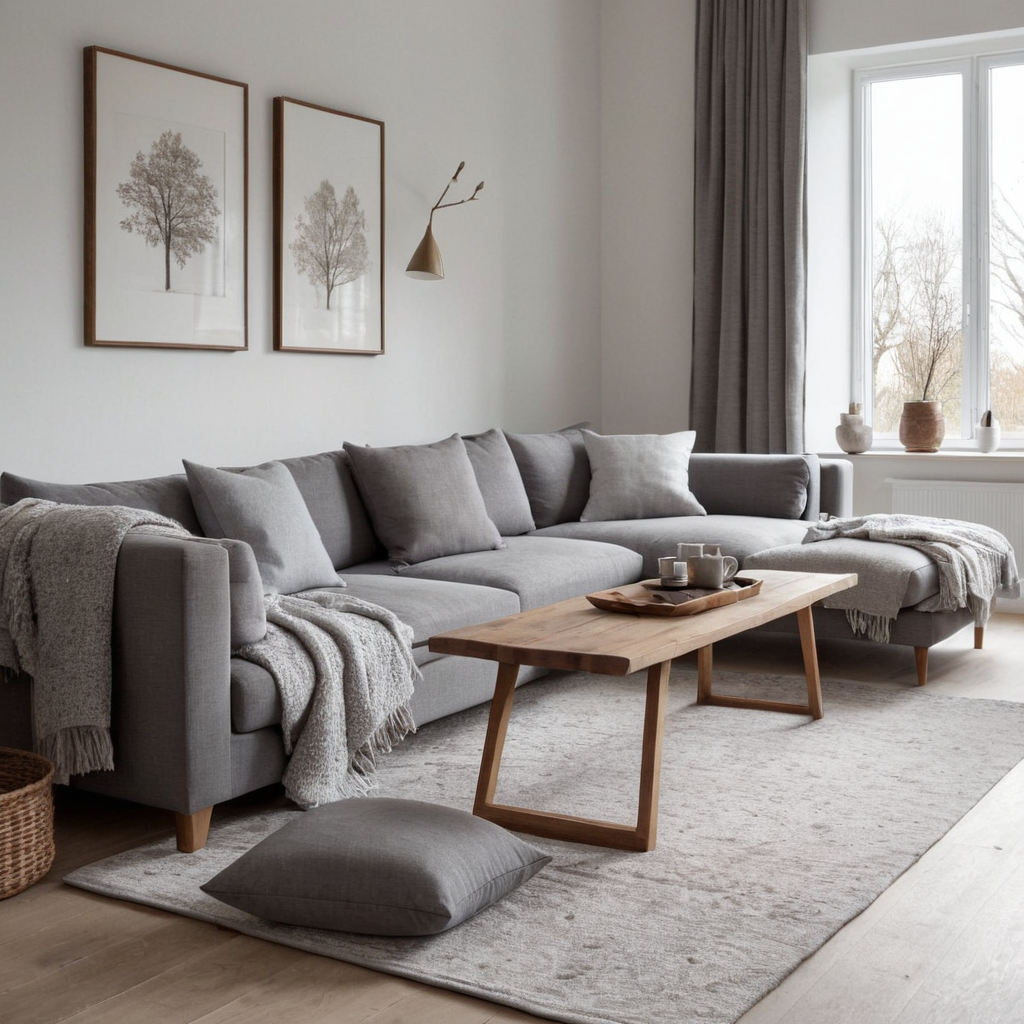
Winter is a season often associated with crisp and clean aesthetics, making white and cool grey the perfect palette for this time of year. These colors evoke a sense of tranquility and can help create an atmosphere that feels both serene and modern. The combination works especially well in rooms where you want to feel cozy yet not overwhelmed by color.
Practical advice: Use pure white as the base tone across walls, ceilings, and large furniture pieces. Add depth with cool grey accents like throw pillows, rugs, or decorative objects. For a touch of warmth, incorporate wood tones or soft textures such as wool and linen.
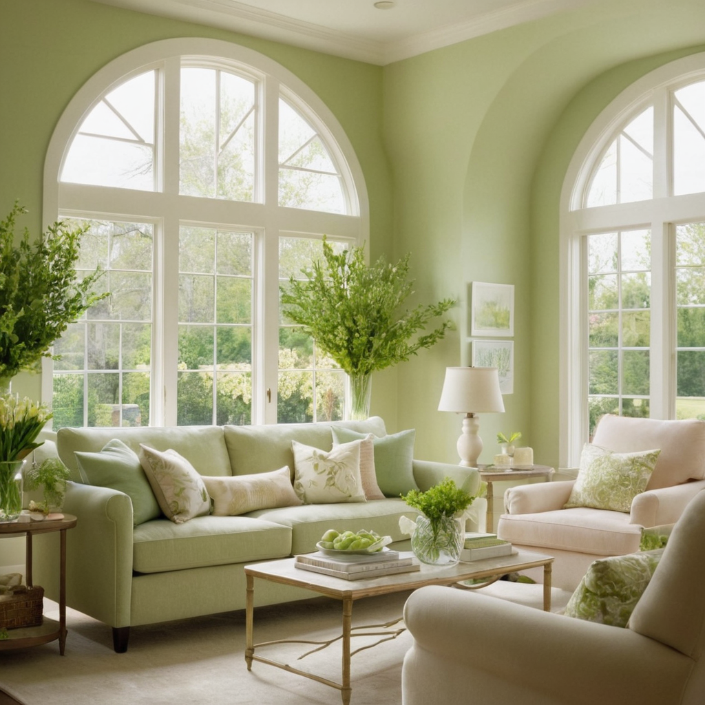
2. Spring Pastels: A Bloom of Softness
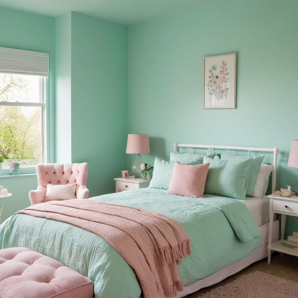
Spring is all about renewal and growth, making pastel shades like mint green, blush pink, and baby blue ideal for this season’s palette. These hues are gentle on the eyes and can infuse any room with a sense of freshness and lightness, perfect for welcoming warmer weather. Pastels work well in bedrooms or children’s rooms where you aim to create a calming yet uplifting environment.
Styling tip: Start by incorporating pastel tones through smaller elements like bedspreads, curtains, or wall art before committing to larger-scale paint projects. Layering textures and patterns can add interest without overwhelming the space with color.
3. Summer Brights: Vibrant and Lively
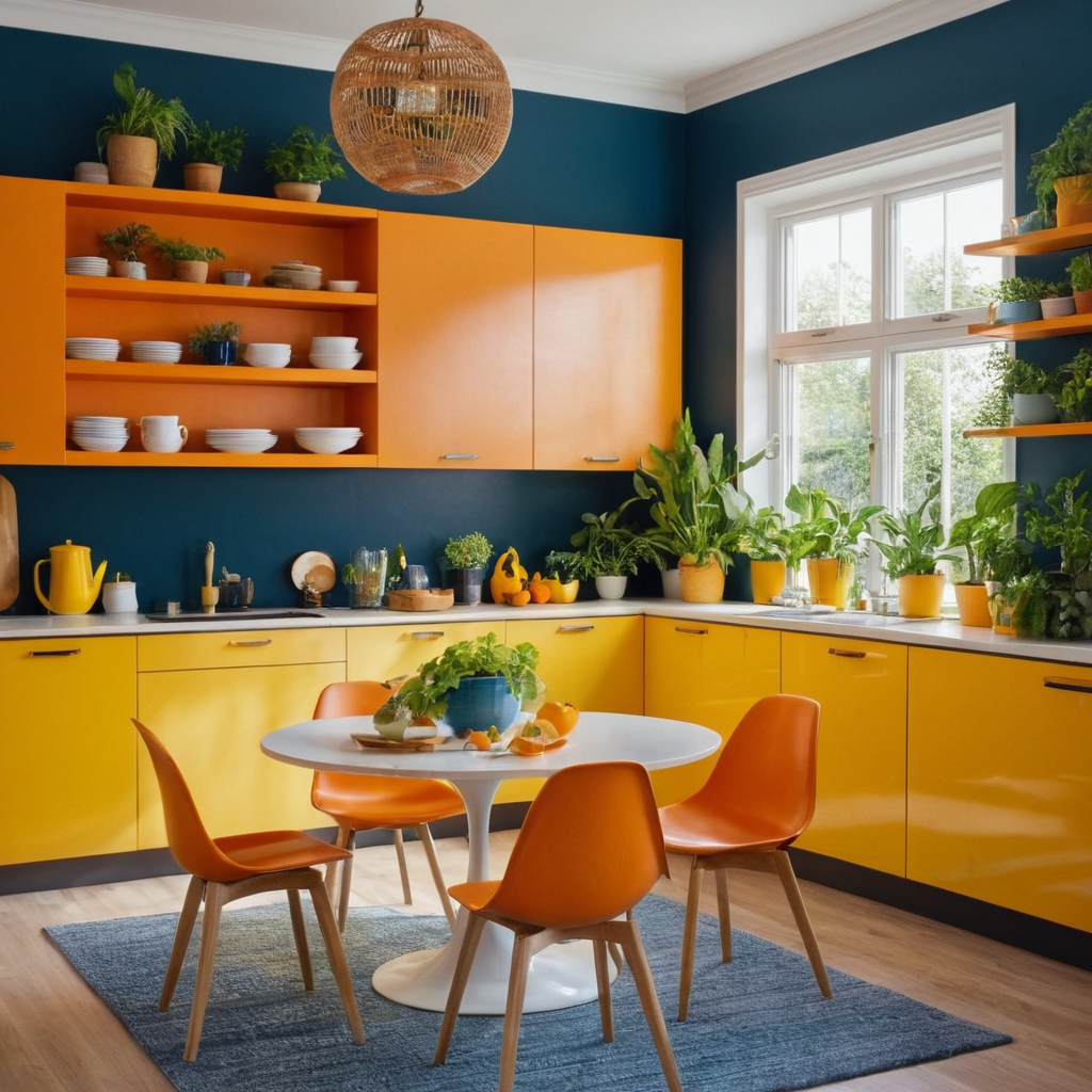
Summer is a time to embrace bold and bright colors that reflect the vibrancy of the season. Think deep blues, rich yellows, and fiery oranges – these hues can energize your space and make it feel lively and engaging. These colors work great for kitchens or dining rooms where you want to stimulate conversation and appetite.
Practical advice: Use bold colors on accent walls or in small doses through accessories like dishes, cushions, or vases. To balance the brightness, incorporate neutral tones and natural elements such as wood or stone, which can ground the space.
4. Autumn Terracottas: Warm Earth Tones
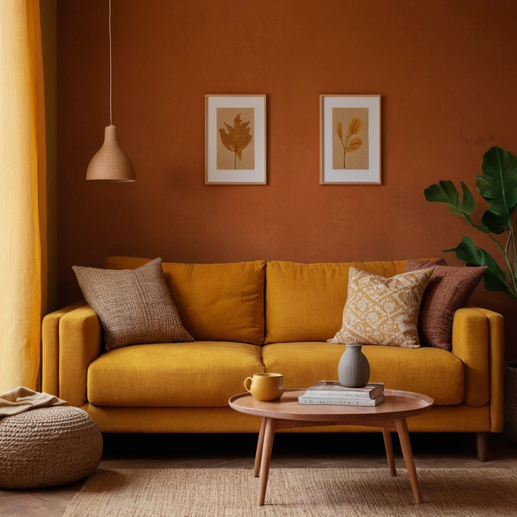
Autumn brings a palette of warm earthy tones like terracotta reds, mustard yellows, and rich browns that can make any space feel inviting and welcoming. These colors are perfect for creating cozy atmospheres in living rooms or reading nooks where you want to relax and unwind.
Styling tip: Use these warm tones on larger furniture pieces such as sofas or chairs to anchor the room. Add texture with materials like wool, velvet, or textured ceramics that complement the autumnal hues.
5. Neutral Nostalgia: Timeless Elegance
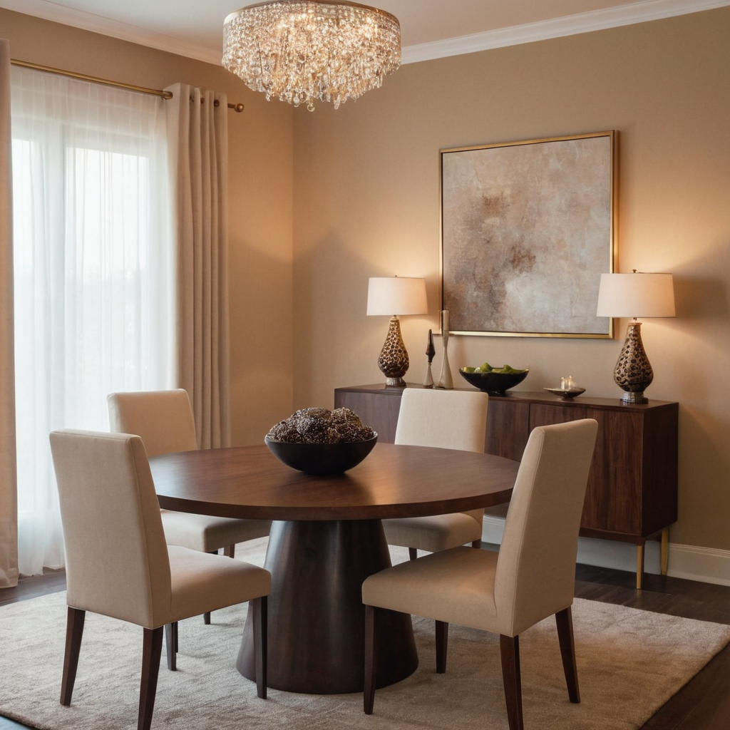
Neutral colors like beige, taupe, and cream can create a timeless and elegant look in any home. These shades are versatile enough to work well with most decor styles and can provide a backdrop that allows other elements of your design to stand out. Neutral palettes are especially effective in formal areas such as dining rooms or entryways where you want to maintain a sophisticated aesthetic.
Practical advice: Use neutral tones for large surfaces like walls and ceilings, then add interest through patterned textiles or artwork. Incorporate small pops of color through accessories like vases or decorative objects to keep the space from feeling bland.
6. Coastal Blues: Tranquil Water Views
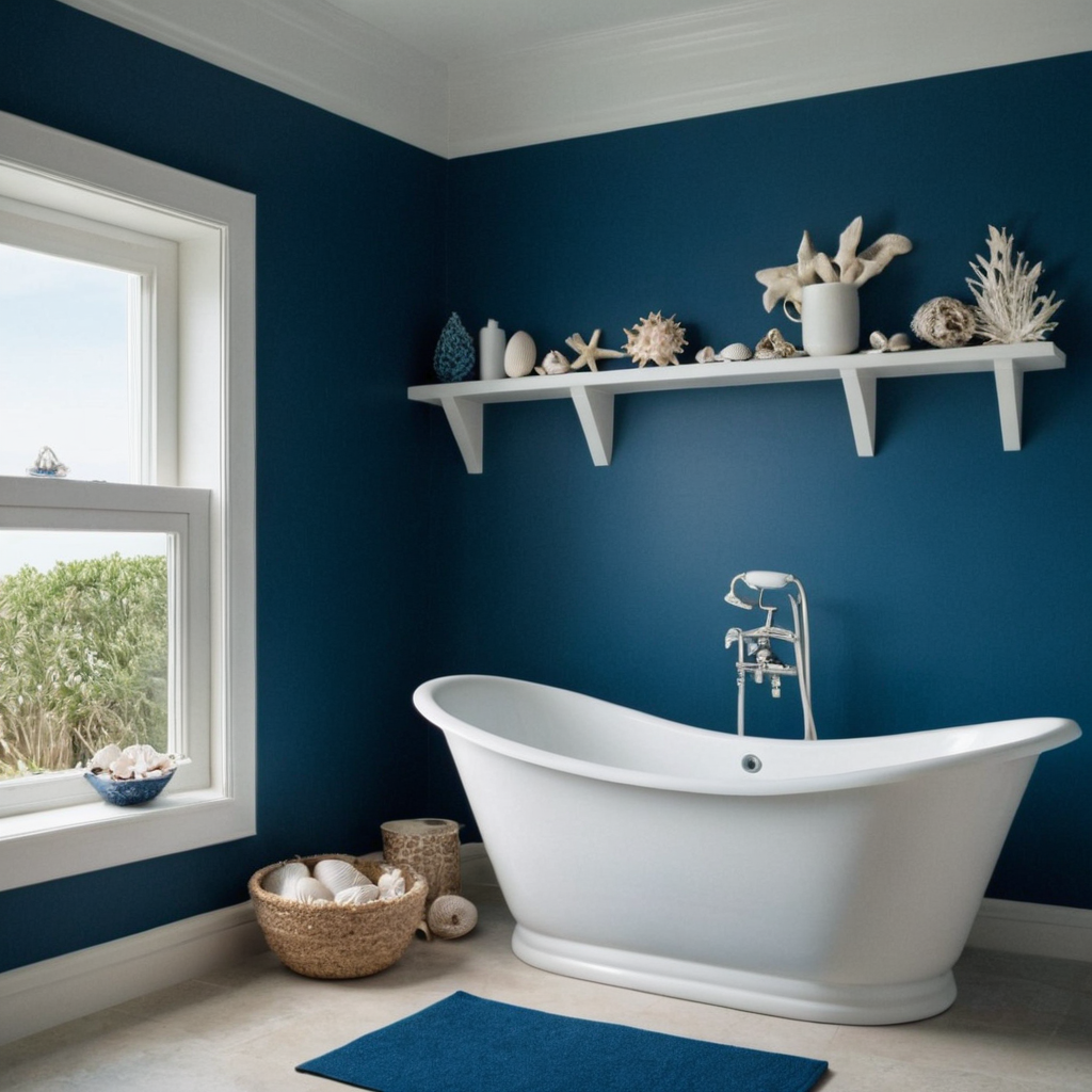
Inspired by the serene beauty of coastal landscapes, shades of blue paired with white can create a calming atmosphere reminiscent of seaside retreats. This palette works well in spaces where you want to evoke feelings of tranquility and relaxation, such as bathrooms or bedrooms.
Styling tip: Start with light blues for walls or larger surfaces, then layer in darker blues through fabrics like bedding or curtains. Add elements that mimic the sea, such as seashell decorations or blue glassware.
7. Urban Charcoal: Modern Sophistication
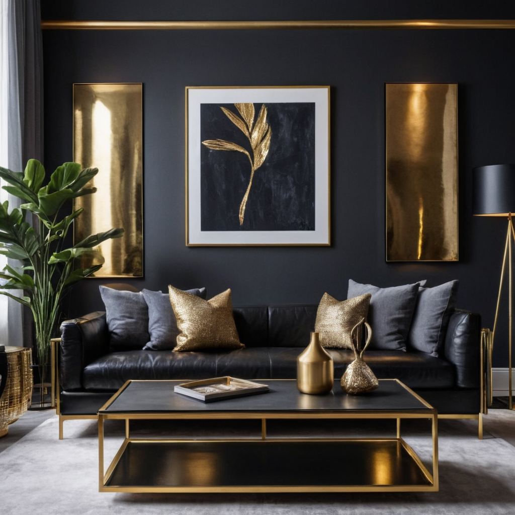
Urban living often inspires a palette of deep tones like charcoal black or dark grey, paired with metallic accents for an edgy yet sophisticated look. This palette can make any space feel modern and chic while adding depth to the room’s overall design.
Practical advice: Use charcoal as the dominant tone on walls or large furniture pieces. Add shine through metal accents in fixtures or decor, such as chrome hardware or brushed nickel frames. Keep other elements simple with monochrome textiles to avoid visual clutter.