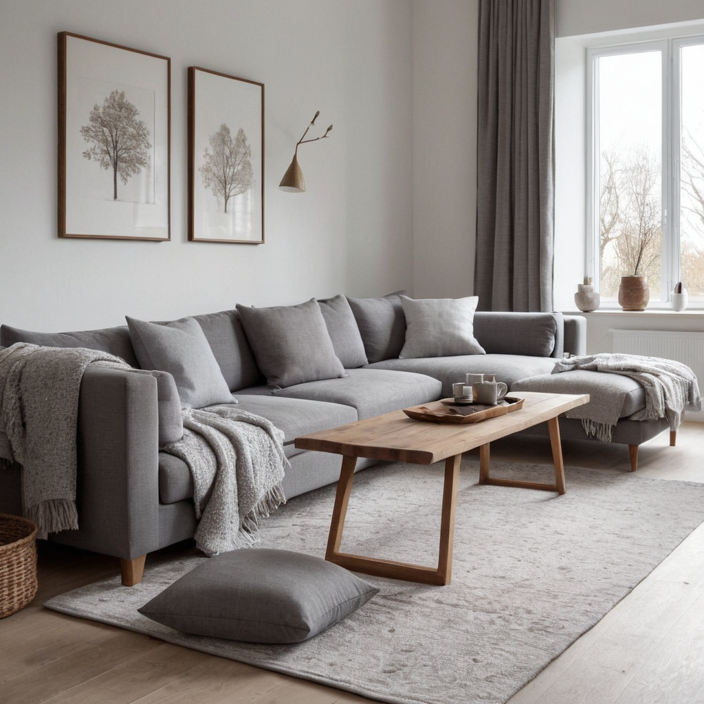
1. Winter White: A Fresh Start
Winter is the perfect time to embrace crisp, clean whites that evoke purity and simplicity. This palette works well with cool tones like blue or grey, creating a serene and calming environment. The white base allows for easy integration of seasonal decorations, making it adaptable throughout the year. White spaces also reflect light, making rooms feel larger and brighter during darker winter months.
To style your space, consider incorporating textured elements such as fluffy throws, linen curtains, and matte-finished ceramics to add depth without overwhelming the clean palette. Use accessories in silver or icy blues to tie into the cool tone theme.
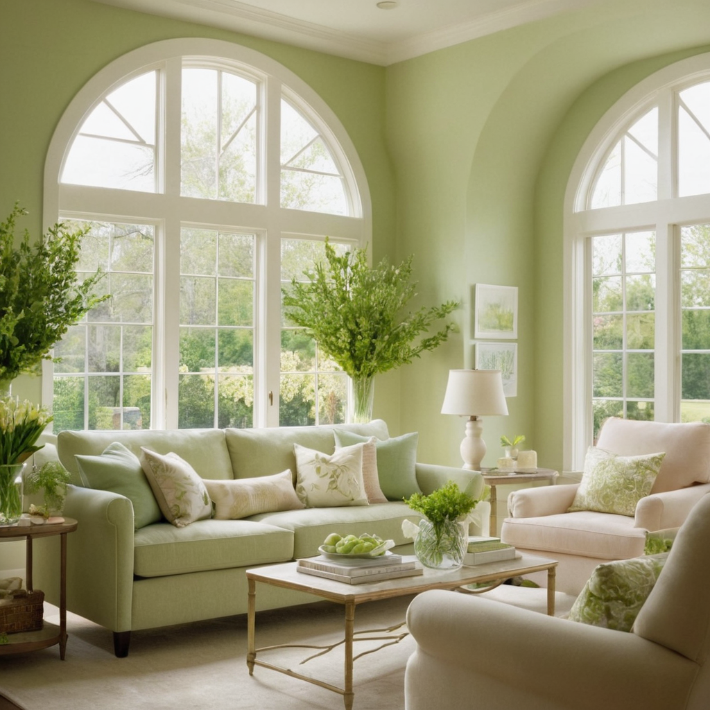
2. Spring Pastels: A Soft Awakening
Spring brings a fresh wave of color that can be beautifully captured in pastel palettes for your home. Think soft pinks, baby blues, and light greens – these colors evoke feelings of renewal and tranquility. Pastels are particularly effective when paired with neutral backgrounds like beige or white, allowing the gentle hues to take center stage.
When decorating, choose materials that enhance the airy feel of pastel tones; cotton and chiffon fabrics can create a breezy atmosphere. Accessorize with small floral prints and delicate patterns to complement the seasonal theme without cluttering the space.
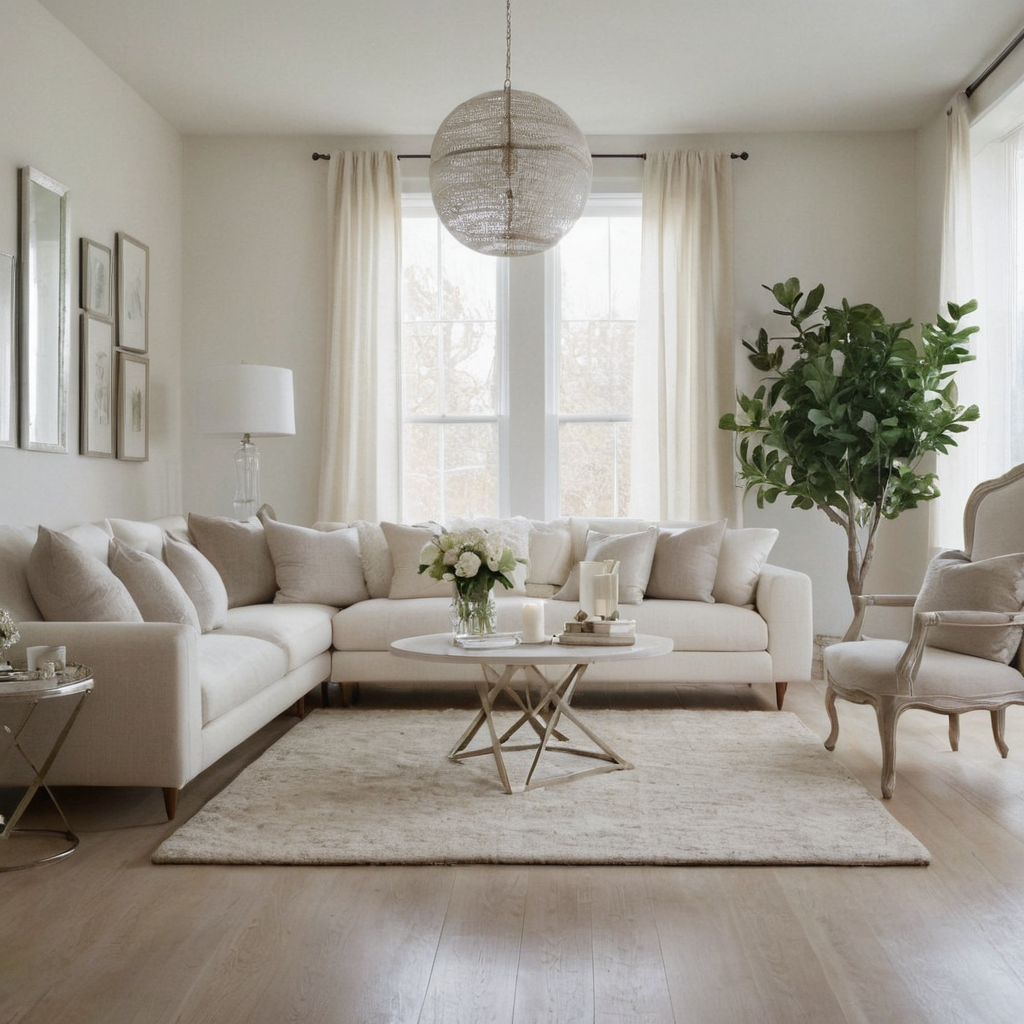
3. Summer Neutrals: Sun-Drenched Elegance
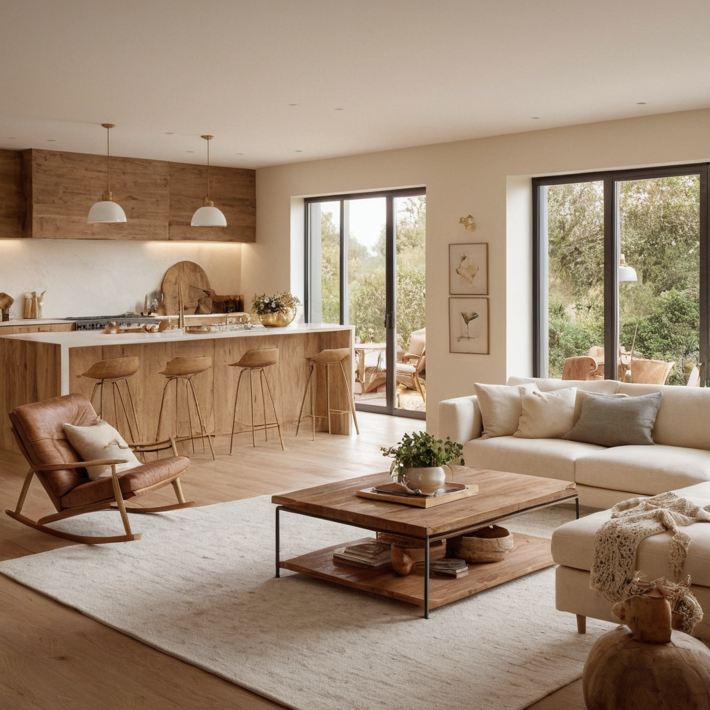
Summer is a great time to adopt a neutral palette that reflects the sun’s warmth and light. Think of tones like beige, cream, and sandy browns which can create a welcoming ambiance in any space. These colors mimic natural elements found in summer landscapes such as sand and earth, making them very grounding.
Incorporate warm textures into your decor to enhance this palette’s appeal; think jute rugs, wooden furniture, and wicker baskets. Adding touches of metallics like gold or brass can also evoke a luxurious yet relaxed vibe.
4. Autumn Earth Tones: Warm and Cozy
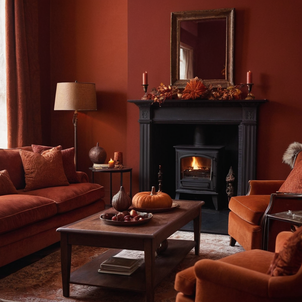
Autumn’s rich colors can bring warmth and coziness to your home. Think of deep reds, burnt oranges, forest greens, and browns – these hues evoke feelings of comfort and abundance typical in fall. Incorporating these earth tones into your decor can make any room feel like a welcoming sanctuary.
When choosing materials for this palette, consider items that are both warm to the touch and visually inviting; wool textiles, velvet cushions, and hand-woven rugs add texture and warmth. For accessories, opt for natural elements such as wooden bowls or dried flowers, which complement the earthy tones beautifully.
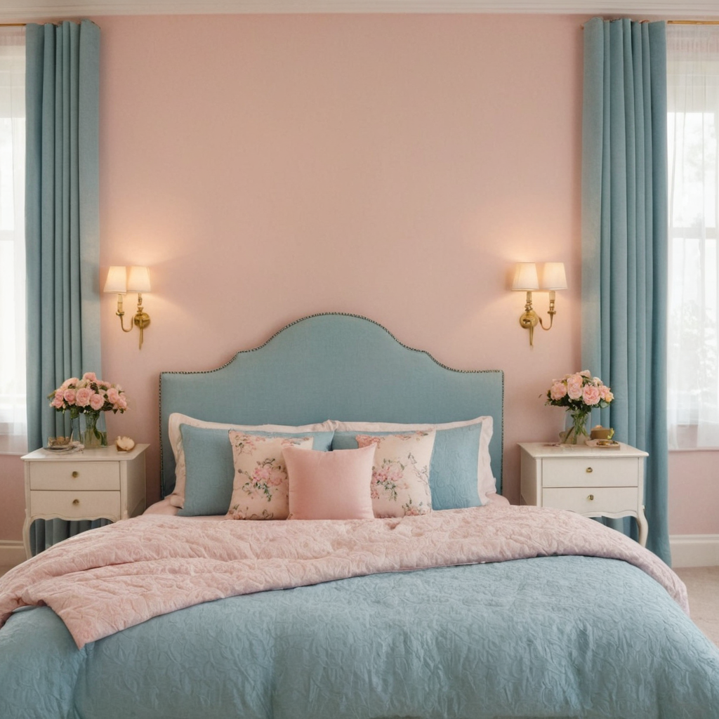
5. Accent Wall Blues: A Splash of Calm
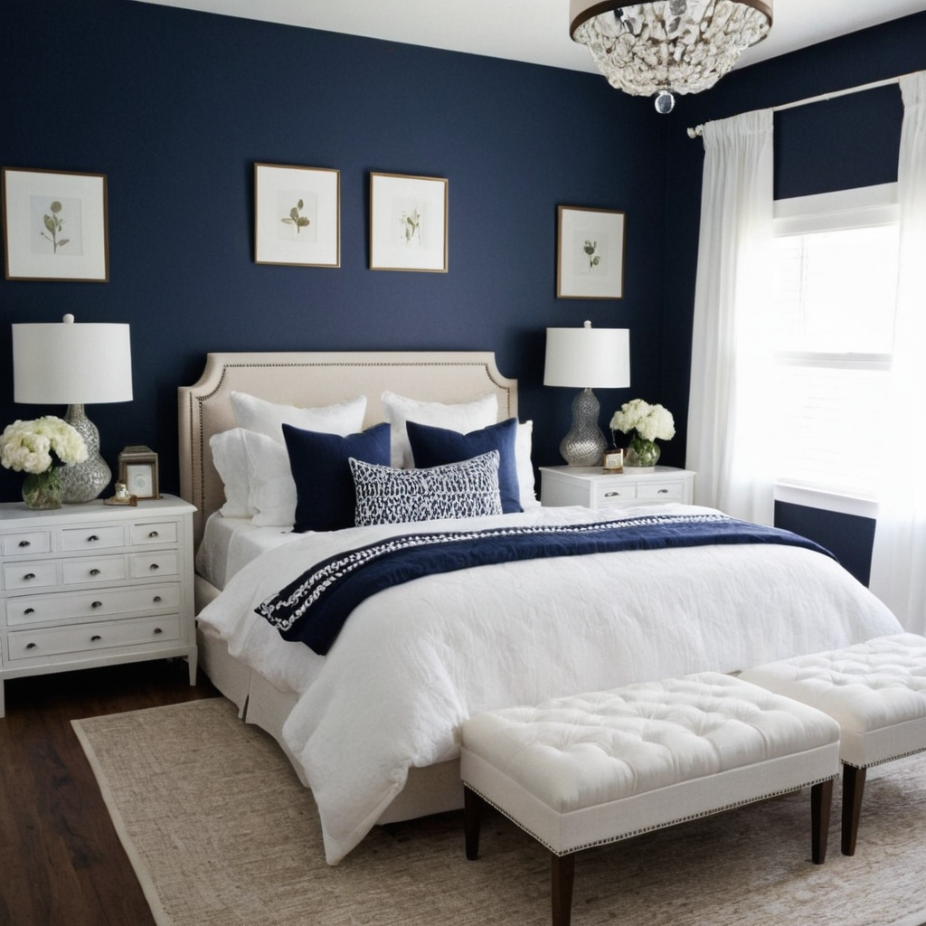
Adding a bold accent wall in blue can transform any space into a serene retreat. Blue is known for its calming effects, making it ideal for bedrooms or living rooms where relaxation is key. Whether you choose a deep navy or a light periwinkle, the color adds depth and character to your room.
To style around an accent wall of this nature, select furniture in neutral colors that won’t compete with the wall but will instead provide contrast and balance. Consider adding accessories such as throw pillows or curtains in shades of blue that complement the accent wall without overwhelming it.
6. Accent Wall Greens: A Fresh Perspective
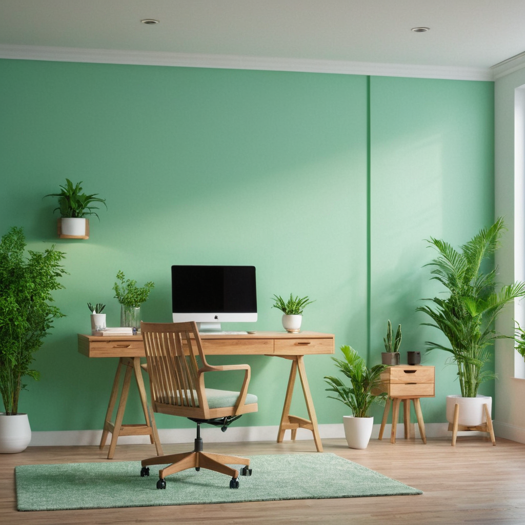
For an energetic and fresh feel, consider using green as your accent wall color. Green is associated with nature and rejuvenation, making it perfect for spaces where you wish to promote growth or focus, such as a home office or children’s room. The right shade of green can make a space feel more alive and vibrant.
When incorporating green into an accent wall, choose pieces that highlight the color’s natural qualities; think plants in matching pots and wood accents. Balance with neutrals like white or beige to avoid overwhelming the senses and maintain a clean look.
7. The Psychology of Yellow: Brightening Spaces
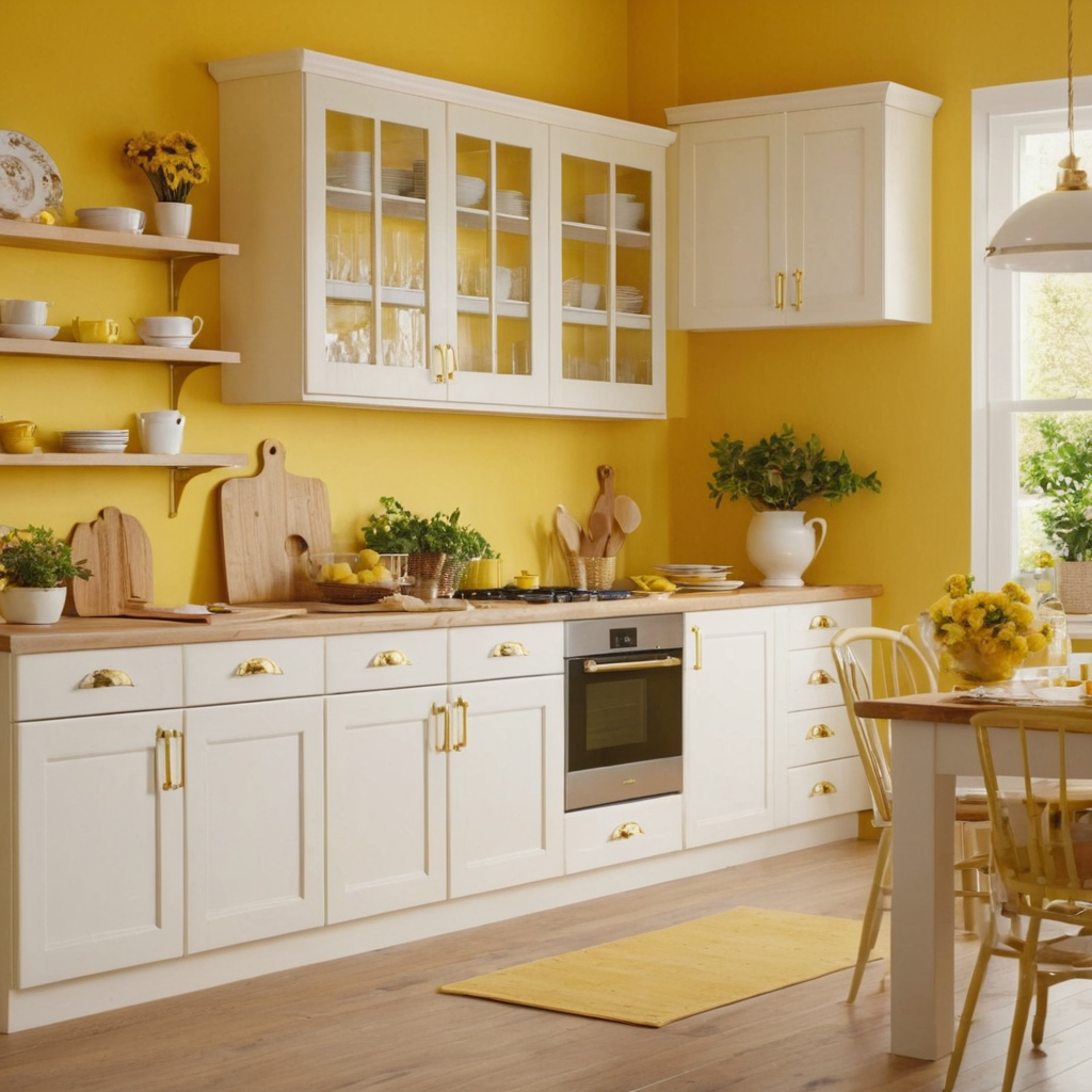
Yellow is a color that exudes warmth and optimism, making it an excellent choice for rooms where you want to enhance positivity and cheerfulness. From cheerful yellows to more subdued mustard shades, the right yellow can uplift your mood without overwhelming the senses.
When using yellow in your home decor, consider its placement carefully – bedrooms might benefit from softer tones, while kitchens or dining areas could handle brighter shades. Mix with neutrals for a balanced look, and add metallic accents like gold to enhance the brightness of the room.
8. Purple: Royal and Luxurious
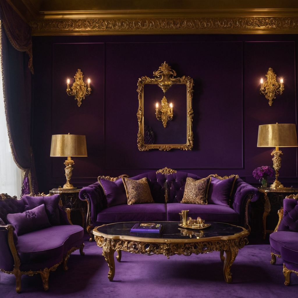
Purple is a color that carries both mystery and royalty, making it an excellent choice for creating luxurious and sophisticated spaces. Whether you choose deep purples or lighter lilacs, the hue can add depth and intrigue to any room.
When decorating with purple, balance is key. Use this bold color in moderation, perhaps on an accent wall or as a primary feature in a small area like a reading nook. Pair with metallics such as silver or gold for added luxury, and include lush textiles like velvet or silk to enhance the richness of the color.