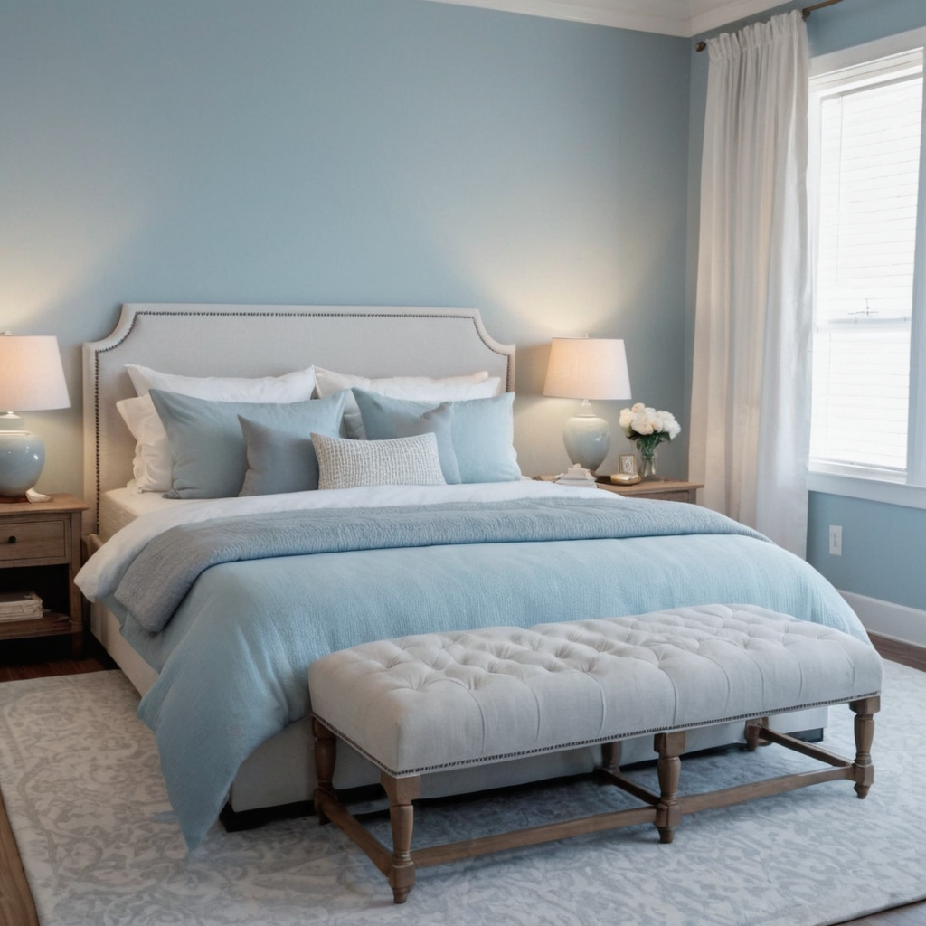
1. Winter Blues: Serenity and Calm
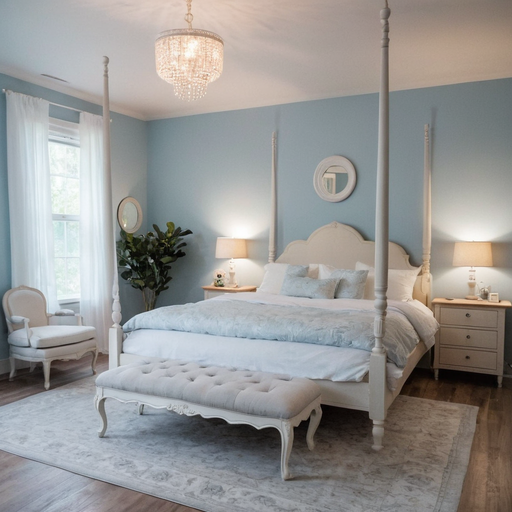
Winter blues evoke a serene and calming atmosphere, perfect for creating restful spaces in your home. These cool tones can make rooms feel larger and more open. Pair shades of blue with white or grey to keep the space modern and inviting. Use deeper navy hues as accents to add depth without overwhelming the room.
When choosing winter blues for your walls, consider using them in bedrooms or living areas where relaxation is key. Incorporate accessories like cushions and rugs in complementary cool tones to maintain a cohesive look. Adding pops of bright white can balance the coolness and create a fresh feel.
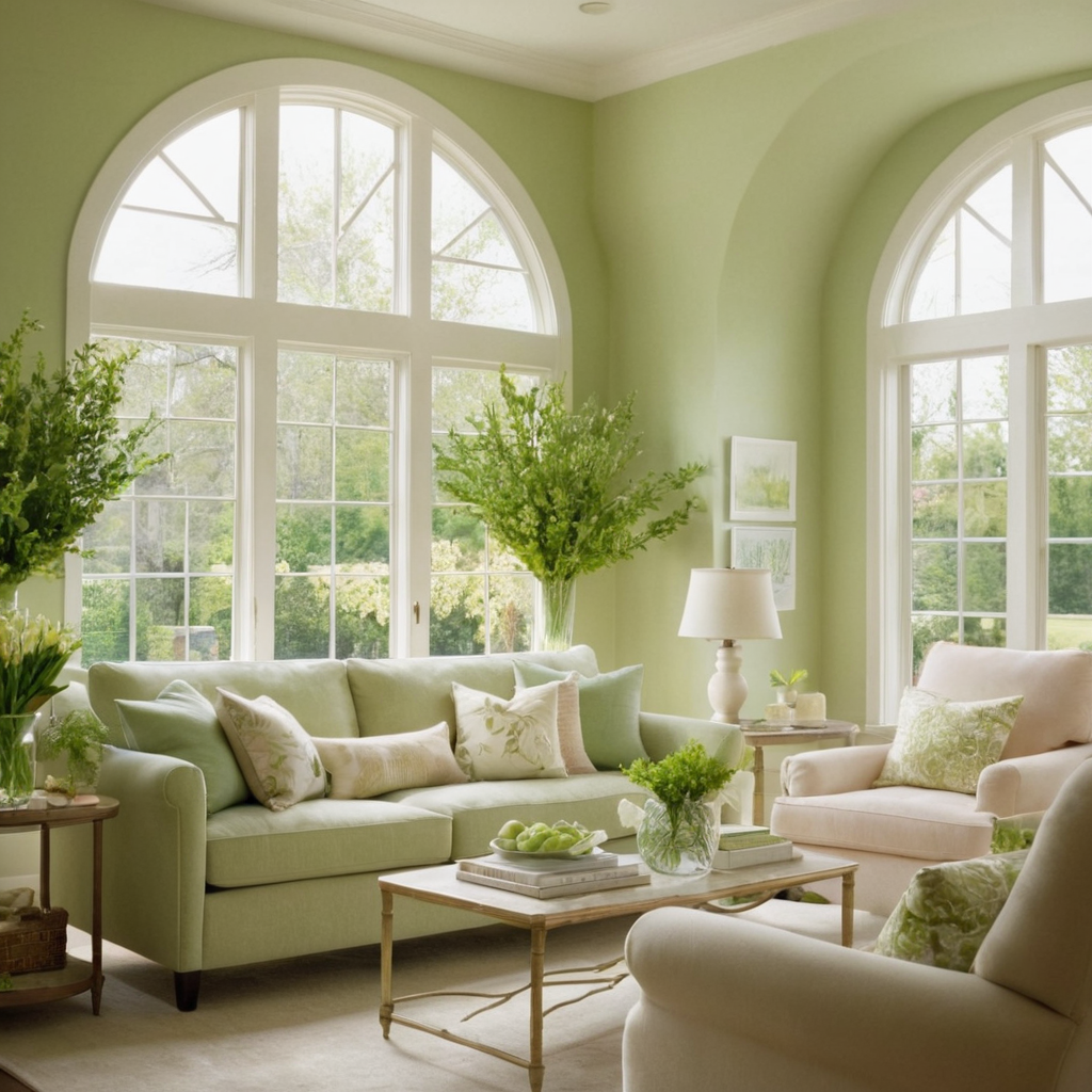
2. Spring Greens: Renewal and Vitality
Spring greens symbolize renewal and vitality, making them perfect for refreshing your home’s interior during the warmer months. These colors can bring an element of nature indoors and create a lively, energetic environment. Use soft shades of green in combination with neutral tones like beige or light grey to maintain a balanced look.
For practical application, consider painting one wall as an accent in a vibrant spring shade. Pair this with natural wood furniture for added warmth and texture. Freshen up your living space with plants that complement the color scheme, ensuring the area feels lively and inviting.
3. Summer Yellows: Warmth and Happiness
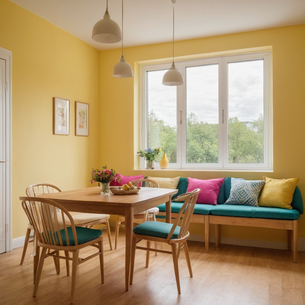
Summer yellows are bright and cheerful, ideal for adding warmth and happiness to your home decor. These colors can create an uplifting atmosphere in dining rooms or kitchens where gathering with family and friends is common. Pair yellow tones with white to maintain a clean look or with darker shades of brown for a more rustic feel.
To incorporate summer yellows effectively, use them as accents through throw pillows, curtains, or decorative accessories rather than painting the entire room. Choose light yellow walls for dining areas to enhance appetite and conversation. Adding wooden elements can ground the space and prevent it from feeling too overwhelming.
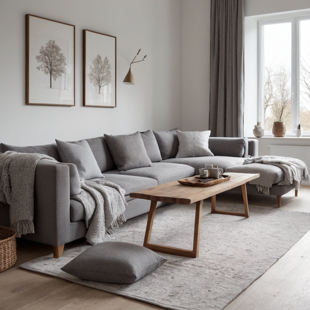
4. Autumn Browns: Comfort and Warmth
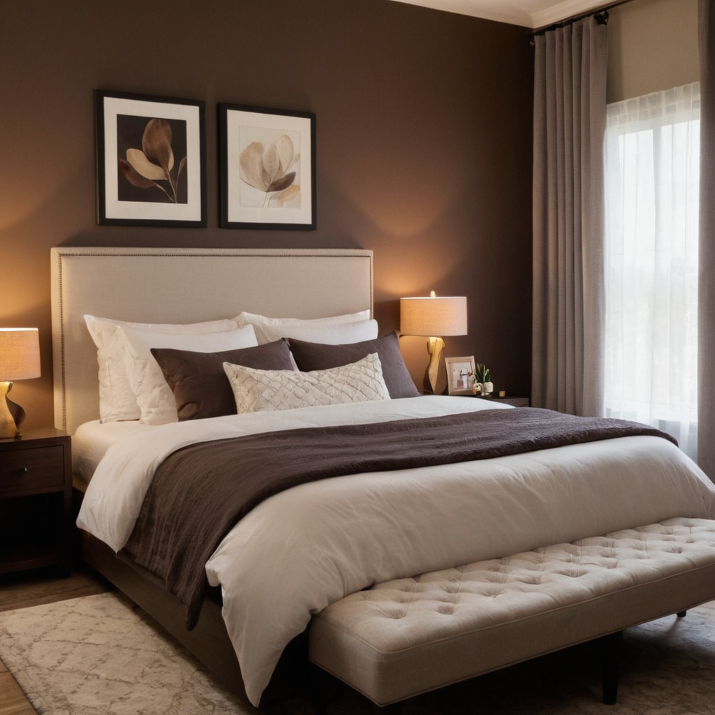
Autumn browns represent comfort and warmth, making them an excellent choice for achieving a cozy feel in your home during the cooler months. These earthy tones can create a sense of grounding and stability in rooms where relaxation is key, such as bedrooms or reading nooks. Combine brown with neutral colors like white or grey to keep the space from feeling too heavy.
For styling tips, consider painting an accent wall in rich chocolate or coffee shades for added depth without overwhelming the room. Use textiles and decor items that complement these tones, such as throw blankets and rugs in matching hues. Adding wooden elements can enhance the coziness of the space, while warm lighting fixtures can further evoke a welcoming atmosphere.
5. Earthy Neutrals: Timeless Elegance
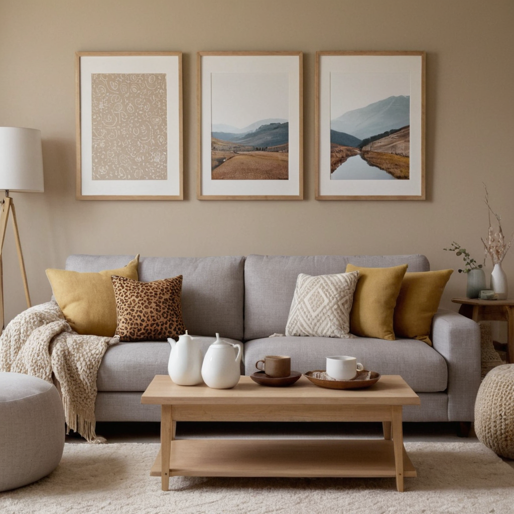
Earthy neutrals provide timeless elegance to any room, serving as versatile backdrops that can complement various design styles. These tones create a calming effect without being too bold or distracting. Neutrals such as beige, taupe, and light grey are ideal for creating cohesive spaces where you want the furniture and decor to be the focal point.
To use earthy neutrals effectively in your home, paint large areas like walls in these colors to provide a clean canvas. Use rich textiles with natural fibers to add texture and warmth. Mix and match patterns and textures from neutral tones for added interest without overwhelming the space.
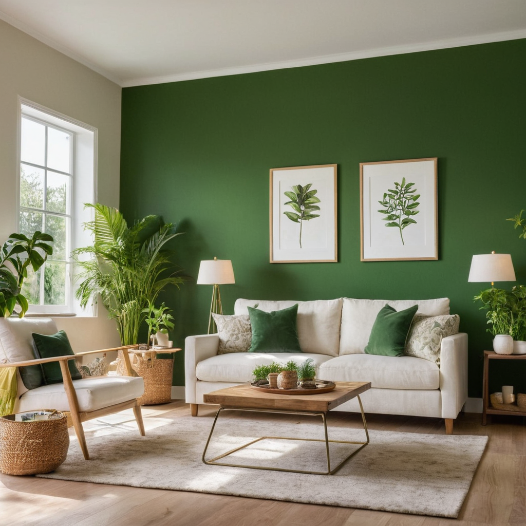
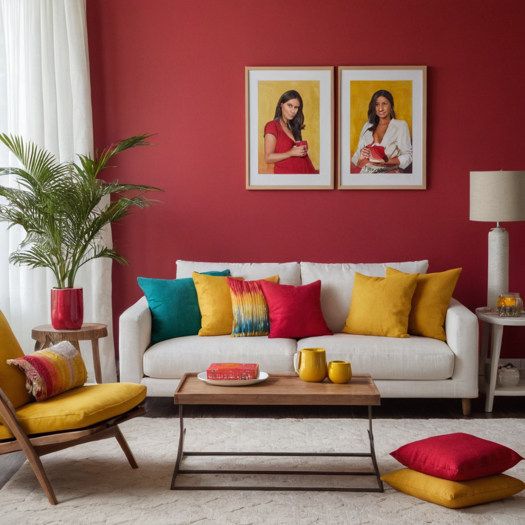
6. Bold Accents: Adding Personality
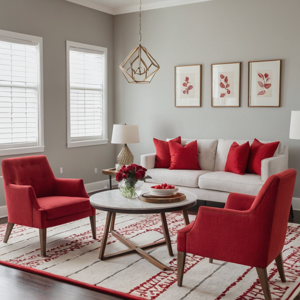
Bold accent colors can add a splash of personality to your home decor, making it stand out and feel unique. These vibrant hues are perfect for small areas like dining chairs or statement accessories that will draw the eye. Using bold accents is an excellent way to express creativity in interior design without overwhelming the space.
When incorporating bold accent colors, choose one dominant color per room to avoid clashing with other elements. Consider using these colors on furniture pieces such as armchairs or side tables for a balanced look. Mix in complementary shades through decor items like art pieces and rugs to create harmonious combinations.
7. Psychological Effects: Creating the Right Mood
Colors have psychological effects that can significantly influence the mood of a space. Understanding these effects is crucial for creating environments that evoke specific feelings or emotions. For example, blue tones promote calm and relaxation, while yellow boosts energy and happiness.
To utilize color psychology effectively in your home design, consider the purpose of each room and choose colors that complement its intended function. Bedrooms benefit from soothing shades like blues or greens to encourage restful sleep, whereas kitchens should be bright with warm yellows to stimulate appetite.
8. Seasonal Rotations: Refreshing Your Home
Rotating your color palette seasonally can keep your home feeling fresh and aligned with the changing moods of each time of year. For instance, cool blues for winter convey calmness, while warm yellows bring vitality in summer. This approach allows you to enjoy different atmospheric settings throughout the year.
To easily rotate colors seasonally, focus on using decor items that can be changed frequently such as cushions, rugs, and curtains. Swap out these elements based on seasonal trends or personal preferences to refresh your home’s look without major renovations.